|
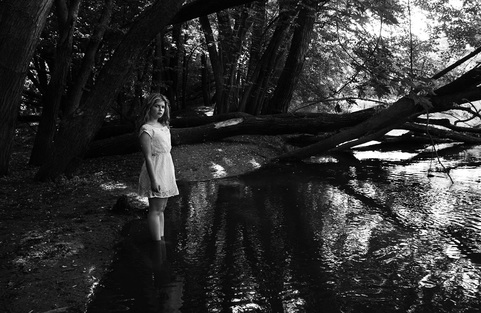
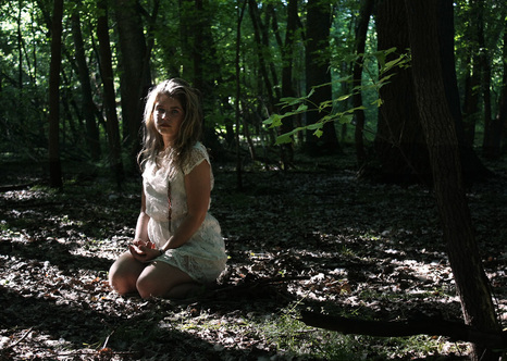
For my personal voice, I am considering doing minimalism, although it would be hard to do well. After trying some minimalism ideas of mine, they didn't turn out. So then I thought I would try nature photography. I had a good location to go for this. It is outdoors near the Crow River.
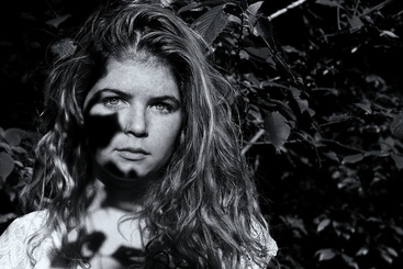
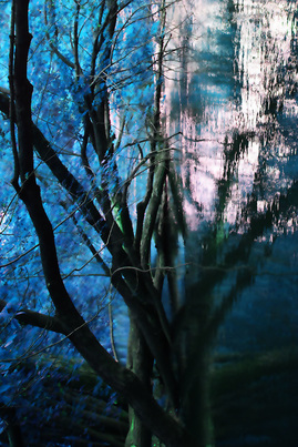
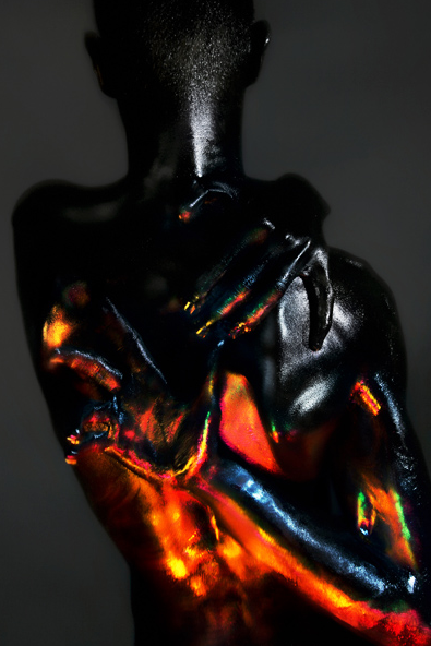
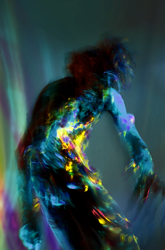
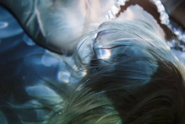
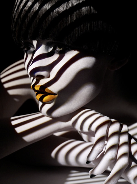
I ended up trying this and I wasn't very happy with them except I do have one photo that I think I will submit for my final. I am not sure that I work well with just nature as a subject. So, now I want to try going back with Anastasia as my model and combine both nature photography and portraiture. 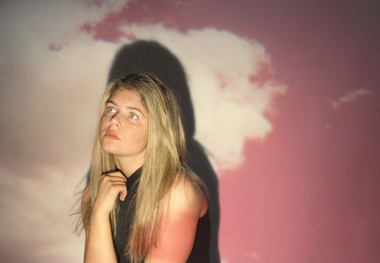 I love the feeling of this photo. It has a very angelic, dream-like feeling. The one major thing that bothers me about this photo is the shadow and how it isn't proportional to her body, unlike the blue and red photo in which the shadow is and it adds repetition to that one. In this photo, however, I think that the shadow takes away from the overall image. What I think is very successful, though, is how the projector acts as the lighting, and it worked very well. Her whole face is nicely lit with nice shadows as well. I think the composition is successful as well, and I like how she is not centered. 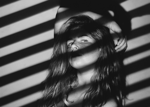 I believe that this image is the most successful because of the way the projection is cohesive with her face and how it creates leading lines. The way her arm is positioned also draws the eye around the frame. I also think this image is very successful in black and white with the high contrast, it adds to the simplicity of the photo, which is further emphasized by the simplicity of the projection. It did take some work the get the projection aligned with her face so that her eyes were aligned with the stripes. The mood of this image is more drama and high fashion, which is what I was going for while creating this projection. 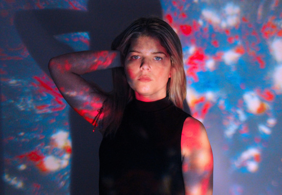 I am very happy with how the photo I projected turned out. The photo was of light reflected off of water, and I used photoshop to play with the colors until I got these vivid reds and blues. I do like how her shadow looks in this and I think it adds some repetition. I also like her pose and how her arm and body create those leading lines. I think the vivid reds and blues compliment her complexion. The blues mirror her eyes while the reds mirror her lips. I wanted a more stoic, fierce look and I think she achieved that here.
Bagrad Badalian.
Projection.
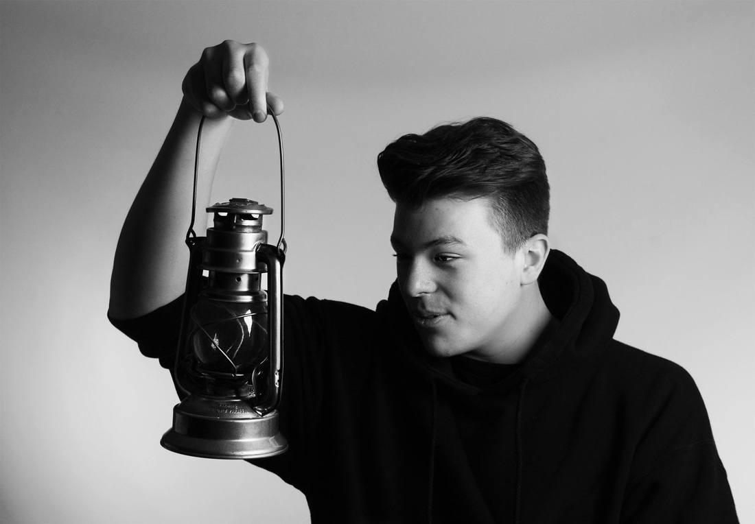 I think the design choices of this photo turned out very well and created an interesting composition. My eye goes directly to his hand, down his arm to the lantern, and then to his face. I like how it is uncentered yet it still has balance. I'd say the way the light is hitting the subject, the lantern becomes the main subject. I really enjoy the lighting in this photo and the way it falls on his hand and the lantern. I also like how half of his face is showed, creating some drama. There is also a wide range of values, creating a nice contrast. The content itself is slightly interesting, mostly because of the lantern. With these photos I tried to be very candid and I think that shows through his facial expression. 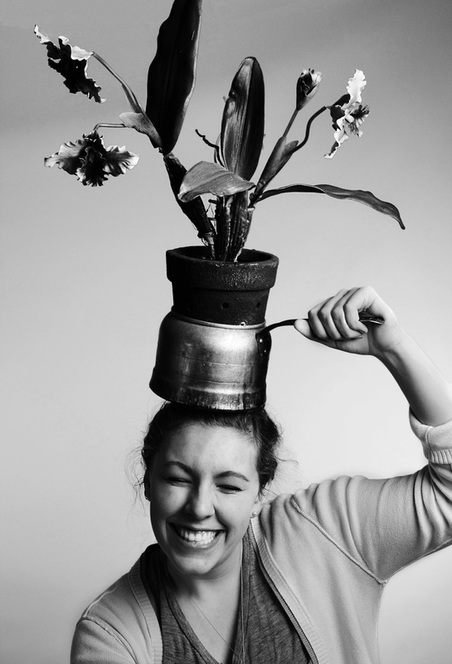 This is probably the most successful photo that I took for this project. I love the energy and the positive emotion that it gives off. It is very quirky and random, just like Carly's personality. I also like the composition, and I like how it is centered but her arm holding the pot and the flowers protruding off to the top rights helps create more asymmetrical balance. It does bug me a little how her elbow is cut off but I don't think it ruins the picture. I also love the affect of the lighting on the flowers, her face, and her arm/hand. I also think that the drama of the black and white contrasts in kind of an ironic way with the happiness in her face.
David Hobby.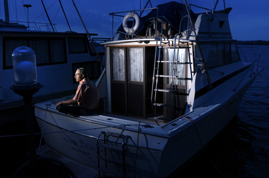 This is a very emotional photo for me, it has a very lonely, depressing emotion. The bright lighting coming from the left of the frame only lights up the man's face and the one small part of his boat. The rest is dark blue, giving it that depressing, dramatic feeling. The man is the main subject and is what immediately catches my eye, the lines of the boat and the ladder lead my eye to the right and back into the frame. The framing of the boat was done nicely, with very little empty space. 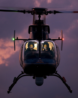 This is my favorite photo of his. The photo has wonderful symmetrical balance with the helicopter centered, leaving little empty space, which I like. However, my eye goes all over the frame, from the faces to all over the airplane. The leading lines of the helicopter parts, however, cause my eyes to become a little confused on where to go next. The lighting is amazing, though, considering what a difficult task it must have been. It gives off an intense, adventurous mood yet the sky in the background gives it an almost whimsical feeling. 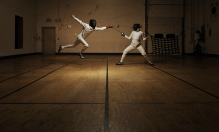 This picture is not my favorite, but I think I would like it more if it was black and white. The mood is very intense, but I feel like it would be intensified by black and white. The lighting is nice though, and the composition is interesting. I have mixed feelings about the fencers towards the top of the frame but after studying it further I grew to like it, seeing how the lines on the floor act as good leading lines, and I think it would bother me more if the were centered. The pose of the fencers is amazing, their bodies making very interesting angles. 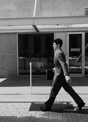 This image captures the movement of the subject, catching him mid-stride. In this way it could be considered a decisive moment. The angle of his legs adds interest to the composition. Both the leading lines and the movement help to draw the viewer's eyes from right to left / left to right. There is also deep contrast between the shadows and the highlights. It has a very stiff mood given by the professionalism of the subject and the stiffness in his stride. 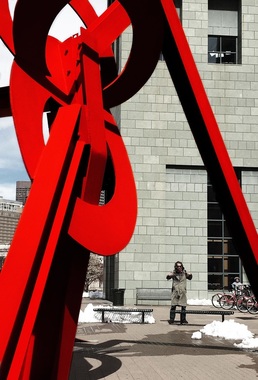 I think that this image is the most successful mainly because of the interesting composition and contrast. The interest is created by both the shape and lines of the sculpture and the pose of the man standing in the opening. There is also deep contrast both between the bright and dull colors and the highlights and shadows. This shows the decisive moment in the positioning of the subject relative to the sculpture and the subject's positioning. 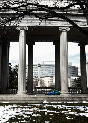 This is probably my second favorite photograph because the decisive moment is clearly there, at least to me. The way the subject is laying against the pillar adds interest to an otherwise simple photograph. There is also contrast between the vivid colors of the subject and the dull colors of the background. There is also an interesting composition with the pillars both adding balance and acting as leading lines, and I think that the tree branches offset this and adds texture to the top, balancing out the texture in the bottom. 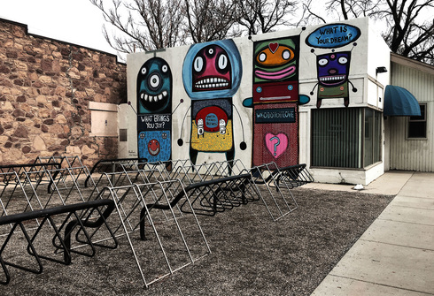 This is probably the least successful photograph just because there isn't a decisive moment. I do like this photograph, however, because there are many of those artistic elements. There is texture in the brick wall and the gravel, repetition and leading lines in the bike racks and the sidewalk, and contrast between the darks and the lights and between the vivid colors in the paintings and the dull colors in the rest. There is also contrast in the mood of the photograph itself. The paintings on the wall are bright and contain positive messages, giving a positive feeling, yet this is contrasted by the barren, dull area around the paintings, which gives it a hopeless, somber feeling. 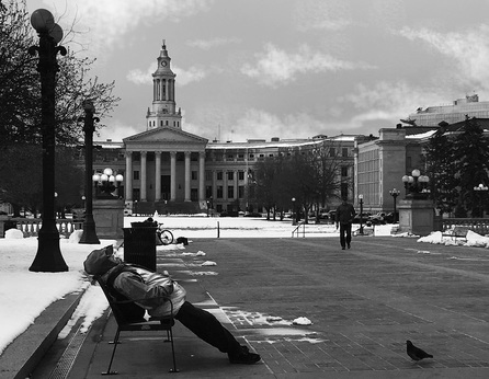 I am not as happy with this photograph because of the quality and how it is unbalanced. However, I chose it because I do find it interesting, and it has somewhat of that decisive moment. The body positioning of the subject is interesting and how he is aligned with the tower on the building adds the interest of the composition. I also like how the street lights interact with the building's tower, paralleling each other. The sky was originally empty so in an attempt to balance out the bottom, I darkened the sky and created clouds using a textured paint brush, and I am proud of how that turned out. 1. YanidelYanidel photographs unique and foreign countries and the people that inhabit them. His photography has the capability of transporting the viewer to those foreign countries (India, Paris, Cuba). He captures honest, candid moments of these foreign people that gives viewers a true feeling of what it would be like to be in that unique land. He does this using dark and rich or light and bright colors depending on the setting. His Paris selection is very romantic and luxurious compared to Cuba, which is more grungy and raw. 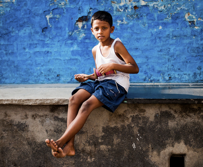 The contrast between the bright and grungy colors creates a color blocking effect that captures interest. The lines of the boys body helps to lead the eye from the bottom left to the top right, or vice versa. The top and the bottom halves of the photo have a nice asymmetrical balance. The attire of the boy and his expression gives viewers an idea of what it is like to live in this area, but this contrasts with the bright, vivid blue of the wall behind him. 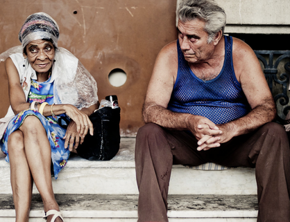 This photo gives off a peculiar feeling from the expressions of the subjects and their attire. The photo is not very balanced, with the right side feeling "heavy". There are pops of color with their clothes against the neutral background. I mainly like this picture not because of the composition, but because of the people themselves. Their attire is peculiar and their expressions make the viewer wonder what the background story is. 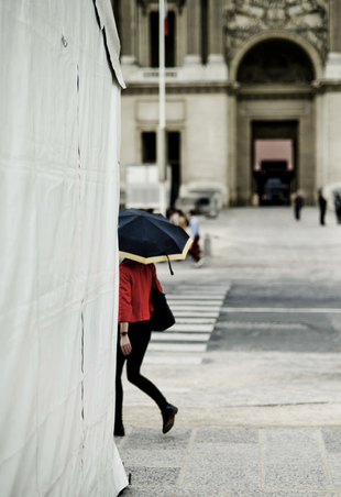 This image has a romantic and mysterious feeling, which suits the setting, Paris. The pop of color with the red coat stands out amidst the bland, neutral colors, creating the focal point which follows the rule of thirds. She, in the bottom left, is balanced out by the archway in the top right. The archway is dark and mysterious, contrasting with her. 2. Lee JeffriesLee Jeffries's street photography is solely made up of portraits of the homeless and he titles it "Lost Angels". He zooms tightly into their faces an creates this deep contrast with rich shadows and bright highlights. They look similar to drawings. He mainly focuses on people with deep wrinkles or interesting differentiating characteristics. His subjects often stare directly into the camera. The portraits bring up an emotion of sorrow or even pity because they make viewers feel as though they are sharing in the subject's emotion. 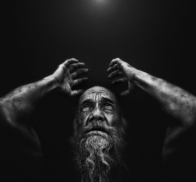 The subject's eyes are cast up with his hands placed as though to protect his head, making viewers wonder why. The dark background contrasts with the highlights of his head, arms, and beard. His beard and wrinkles create some interest in his face. The placement of his arms create nice symmetrical balance. The expression of his face and the dark shadows bring about a feeling of sorrow. 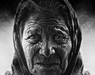 Her wrinkles are the main focus. They create contrast and leading lines across her face, which seems to be fairly shadowed in contrast to the bright background. The woman is centered in the frame, creating a nice symmetrical balance. It brings across a feeling of pity. 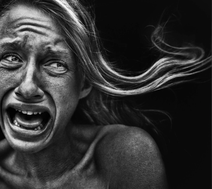 This photo is startling with the extreme expression that gives viewers a deep feeling of sorrow and a desire to comfort her. The way her hair is moving creates leading lines that draw the eye across the frame. There is contrast between the shadows of the black background and the deep lines in her face and the highlights in her hair and face. The expression is captivating and memorable. 3. Rui PalhaRui Palha is a Portugese photographer who focuses on the architecture of foreign cities and the people who live there, with more emphasis on the architecture for the most part. His work is solely in black and white. He often uses leading lines to create interesting compositions that lead the eye across the frame. He also uses high contrast with dark shadows and bright highlights. He seems to use very few people in his photographs, but he does seem to have at least one in most of his photos. He puts most of the emphasis on the architecture rather than the people. 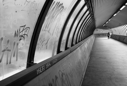 The main interest in this photo is the composition. The leading lines that move into the photo give it a three-dimensional feeling and they lead the eye down into the picture. They also contrast with the curved lines that are almost perpendicular. Where the tunnel leads also uses the rule of thirds and the one person creates more of that interest. 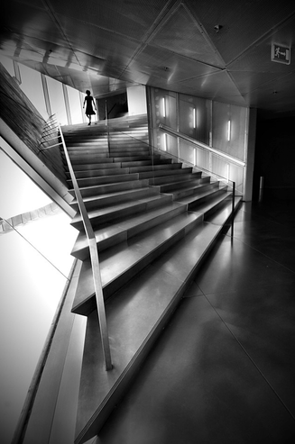 The almost zig-zag direction of the staircase create an interesting composition with the sharp angles leading up the photo. There is also a lot of contrast between the light coming through the windows and the shadows from the stairs and also creates a backlit affect with the woman on the top of the stairs. 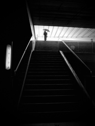 There is again leading lines created with the stairs which directs the eye towards where the person with the umbrella is at the top, backlit by the bright light from where the stairs are leading. This light also contrasts very well with the majority of the photo which is primarily black. The other focal point besides the person is the bright sign on the left of the picture, which balances out the light towards the top right of the photo. |
AuthorWrite something about yourself. No need to be fancy, just an overview. Archives
April 2016
Categories |
 RSS Feed
